
Taiwan Tech achieves international design recognition with five works winning 2026 Red Dot Awards.
The design creativity of Taiwan Tech has once again received international recognition. Five projects by students from the Department of Design were honoured at the 2026 Red Dot Award: Design Concept. The award-winning projects span a diverse range of fields, including education and learning, packaging design, musical instruments and sound technology, visual communication, and personal care and beauty. Drawing inspiration from a variety of subjects, including Taiwan’s native plants, cross-cultural food traditions, DJ music experiences, typeface design, and everyday fragrances, the students have used design to address practical needs and social issues. Their achievements demonstrate the diversity, creativity, and experimental spirit of Taiwan Tech students.
The award-winning project “Formosa Wildscript” (Taiwanese Botanical Cursive Script) was designed by Li-Wen Wang, Yi-Ru Yao, Te-Jung Chung, and Tzu-Hsuan Hung, under the supervision of Professor Szu-Wei Cheng. The project addresses the growing disconnect between people and Taiwan’s native plants as modern urban lifestyles increasingly distance them from the natural environment. Its central aim is to make botanical knowledge tangible. The team selected representative native plants from northern, central, southern, and eastern Taiwan, incorporating their seeds into recycled paper pulp to create “native seed paper”. Through touching, reading, and planting, users can explore a living encyclopaedia of Taiwan’s flora. The designers, Li-Wen Wang, Yi-Ru Yao, Te-Jung Chung, and Tzu-Hsuan Hung, said that being able to devote themselves to something they genuinely care about was already rewarding. Turning their ideas into a design proposal that promotes shared benefits, however, also tested the team’s ability to integrate different skills and perspectives. From model-making and seed paper production to repeated adjustments to the layout and packaging structure, every stage of “Formosa Wildscript” was the result of the team’s collective effort. The final outcome even exceeded their original expectations. The team also expressed their gratitude to Professor Szu-Wei Cheng, who provided encouragement and guidance on the project’s direction from the outset, helping them gradually build greater substance and depth into the work.
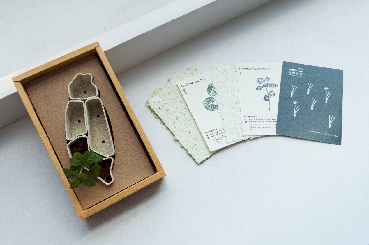
“Formosa Wildscript” incorporates seeds of Taiwan’s native plants into recycled paper pulp to create “native seed paper”. Combining botanical knowledge, paper materials, and planting experiences, the project encourages users to go beyond reading and plant native Taiwanese species themselves.
“Ocean Origin Co.” was designed by Chiao-Li Wu and Chi-Ping Wu under the guidance of Professors Tung-Hung Tsai and Hsiu-Chun Hsu. Using maritime trade as its central concept, the project explores cultural exchange. Its Chinese name, Hai Yuan, refers to the sea as the origin of trade and also symbolises the continuous generation of culture. Through trade, ingredients from different regions become part of everyday life. By preparing and experiencing food, people can connect with the flavours and lifestyles of different places, embarking on a sensory journey across oceans. The packaging design draws on elements of maritime trade, including shipping containers, shipping routes, and port systems. Through the unboxing process and cooking instructions, it illustrates how ingredients travel across oceans before coming together on the dining table. In this way, users experience the cultural encounters and diverse flavours that emerge from the meeting of different culinary traditions. The team said that participating in the competition had enabled them to make further breakthroughs in combining packaging with storytelling. They also expressed their special thanks to their supervisors for guiding them throughout the creative process, helping them broaden their design perspectives and develop the original concept into a more complete project.
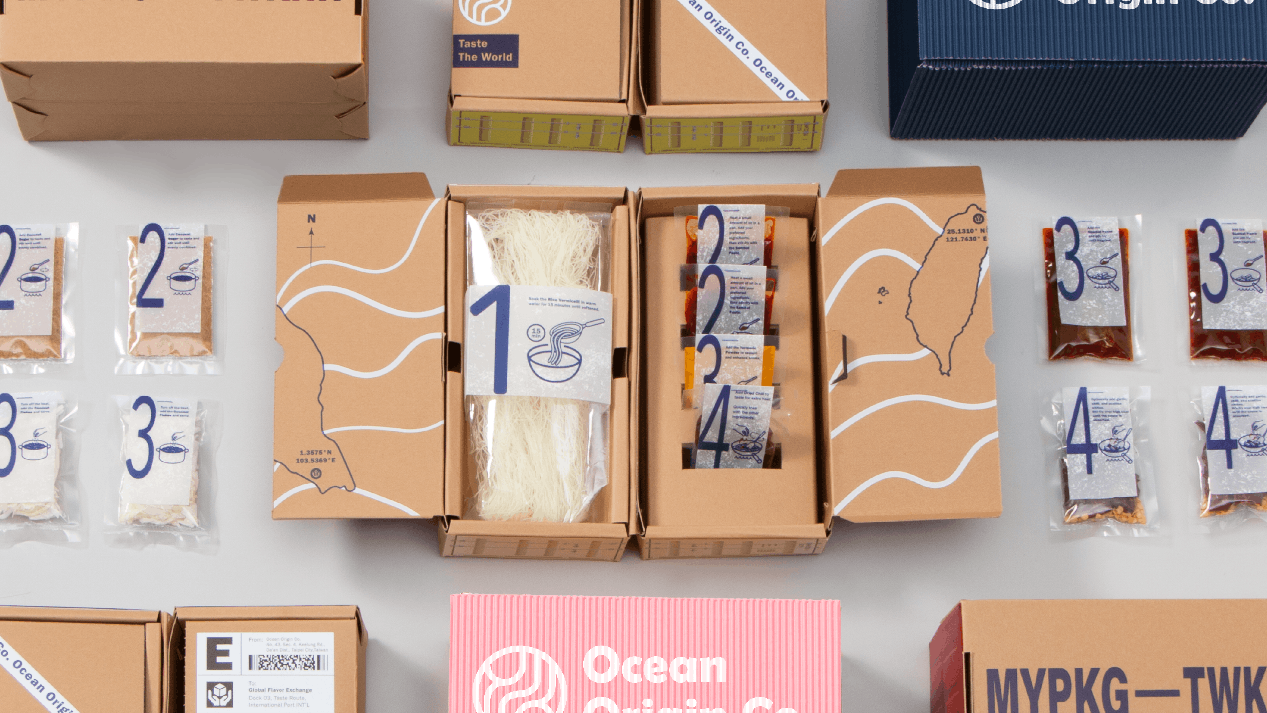
“Ocean Origin Co.” uses maritime trade as its design concept, transforming elements such as shipping containers, shipping routes, and ports into food packaging. By incorporating unboxing and cooking steps, it presents the journey of ingredients across oceans, from their places of origin to the dining table.
Designed by Yi-Yu Lin and Shu-Ting Chiu, “Air Pulse” was jointly supervised by Professors Yu-Ting Cheng and Jui-Teng Pai. The project targets beginners who regard DJing as a leisure interest and seeks to challenge the conventional perception of DJ controllers as complicated and intimidating devices. The team identified the essential functions that beginners need from existing DJ controllers while retaining the potential for future expansion. They replaced conventional circuitry with conductive ink and combined it with an inflatable thermoplastic polyurethane (TPU) material. This approach maintains tactile feedback when users press the controls while reducing the device’s weight, making it more portable and user-friendly. Yi-Yu Lin and Shu-Ting Chiu said they were delighted that their project had received recognition from the Red Dot Award. The honour was a great encouragement and had strengthened their confidence in their work. They expressed gratitude to everyone who had supported them throughout the creative process, including their supervisors for their guidance, the department for providing competition resources, and each other for working together to overcome challenges at every stage. They hope to continue creating more projects in the future.
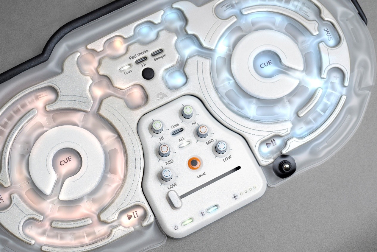
“Air Pulse” redesigns the DJ controller with portability and lightweight construction as its core principles. By combining conductive ink with inflatable TPU material, it reduces the device’s weight while retaining tactile feedback, making the DJ experience more accessible to beginners and better suited to everyday use.
“Crescent”, designed by Yu-Wen Hsu and Chun-Wei Yu, was supervised by Professors Tung-Hung Tsai and Hsiu-Chun Hsu. Inspired by the changing phases of the moon, the project is a variable typeface that uses the concept of gradually changing curvature as its design principle. The letterforms can shift between smoothness and sharpness, combining the rhythmic qualities of classical typeface structures with the clean, precise strokes of modern typography. The result is a visual balance reminiscent of a crescent moon, bringing together elegance and sharpness while demonstrating the potential of typeface design to adapt to different visual contexts. Yu-Wen Hsu and Chun-Wei Yu said they were pleasantly surprised and deeply honoured that their work had received international recognition through the Red Dot Award: Design Concept. They expressed their gratitude for the guidance of their teachers, the encouragement of their classmates, and the support of their teammates throughout the process. They are still immersed in the surprise and joy of receiving the award. Looking ahead, the team hopes to further develop and refine the project so that “Crescent” can eventually be launched as a typeface that people can use in practice.
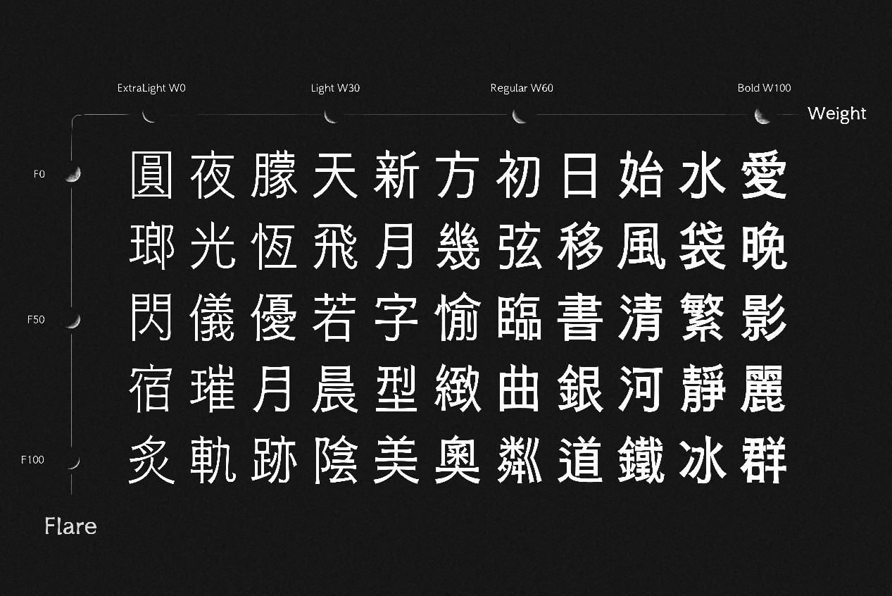
“Crescent” takes inspiration from the phases of the moon and introduces the concept of gradually changing curvature into variable typeface design. Its letterforms can flexibly vary in weight and curvature, creating a typographic style that combines classical rhythm with a modern aesthetic.
Created by Tseng-I Liu under the supervision of Director Ting-Yi Lin, “VENA” draws inspiration from everyday perfume use. With capillary action as its core design principle, the project introduces a refillable, portable perfume container. Tseng-I Liu explained that the design uses visible microchannels to guide the flow of fragrance, making the refilling process cleaner, application more precise, and waste less likely. The transparent glass bottle, combined with stainless-steel components, also allows users to observe the movement of the liquid and see how much perfume remains in the container. Through a simple and intuitive design, the project aims to improve the user experience and create a more refined everyday fragrance ritual.

“VENA” uses capillary action as its core design principle. Visible microchannels guide the flow of fragrance, making perfume refilling cleaner and application more precise. The transparent bottle also allows users to clearly see the movement of the liquid and the remaining amount of perfume.
The five award-winning projects address a broad range of subjects, from natural ecosystems and cultural exchange to music experiences, typeface design, and everyday products. Rather than focusing solely on form and function, the students developed innovative solutions based on user experience, cultural context, and practical needs. Through observation, experimentation, and repeated hands-on practice, Taiwan Tech students transformed everyday challenges and creative ideas into tangible design outcomes. Their success at the Red Dot Design Award highlights the emerging talent and creative energy of the university’s young designers on the international stage.